1. Technique for photographing my pieces, at some point I would guess all artists will need to take pictures of their own work, be it time, financial or some other reason, it would be a great thing to know.
2. How to get said photos of your work correctly formatted for the varying requirements of applications for shows and juried contests.
I suppose those are the only ones I can think of right now, but they have been making a difference as I've been trying to get this show application ready.
Wednesday, October 31, 2012
Genesis
Posting is not going as usual this week, sorry about that. I've got a deadline coming up for a show application (wish me luck there) and it's not sent off yet, and yesterday was my normal blogging day but the days events seriously deviated from my plan. Here's the next piece in the Genesis series. This piece was another one of the first pieces I made for this series, the first ten or so. It comes from Genesis 1:12.


Watercolor
9x9in
2012
Series: Genesis
Photo by Hawkinson Photography
9x9in
2012
Series: Genesis
Photo by Hawkinson Photography
Monday, October 29, 2012
Piece of the Week
This week, two pieces that are currently in the works. Check back to see the final pieces.


Thursday, October 25, 2012
Genesis
This piece is on the same lines of the last two Genesis pieces, although this piece was made before the other two I believe. This has a companion piece that will be shown in a few weeks.


Watercolor
9x9in
2012
Series: Genesis
Photo by Hawkinson Photography
9x9in
2012
Series: Genesis
Photo by Hawkinson Photography
Wednesday, October 24, 2012
Blast from the past
This week's piece, is actually two pieces. Together they make a piece that is better than either on it's own. The plan was to glue them together, this hasn't happen, it may happen someday but who knows.


watercolor
2008
Tuesday, October 23, 2012
Sacred Geometry: A Primer
This week, the Wedjat eye, or the eye of Horus.

 To start you need a square, but make it a bigger square than you might usually use and find the vertical and horizontal axis.

On the left double square draw the diagonals.
 Set your compass with the point on the bottom left corner of the square and the drawing point on the half way point. Arc down until you meet one of the horizontal lines.

Set your compass point on the bottom right corner of the double square. Set the drawing point to where the last arc stopped and arc to the edge of the double square.

Repeat on the top side of the square: set the point on the top left corner of the square, drawing point on the half line and then arc to meet the horizontal line.
 Set your point to the top left corner of the double square and set the drawing point to where the last arc left off. Arc to the edge of the double square.

To draw the pupil of the wedjat eye, set your compass point at the center of the square and set the drawing point to the where the lines and arcs intersect and make a circle.

Next set the compass point on the bottom point of the pupil, set the drawing point at the top of the pupil and arc down to the horizontal line.


Repeat in reverse.

Next the eyebrow. It's drawn like the top line of the eye, but closer to the top (one probably should do it more scientifically than picking an distance that looks good, unfortunately I don't know any other way.)

 Next is the little curly thing under the eye. I realized after doing it that it was facing the wrong way. It will still show you how to do it, you'll just need to flip it around. Actually, you could just draw the curly thing free form, this is just one way to do it.
Set your compass with the point in the center of the pupil and the drawing point to the right most point of the eye. Use this measure to make a square below the eye.


On the left double square draw the diagonals.


Set your compass point on the bottom right corner of the double square. Set the drawing point to where the last arc stopped and arc to the edge of the double square.

Repeat on the top side of the square: set the point on the top left corner of the square, drawing point on the half line and then arc to meet the horizontal line.


To draw the pupil of the wedjat eye, set your compass point at the center of the square and set the drawing point to the where the lines and arcs intersect and make a circle.

Next set the compass point on the bottom point of the pupil, set the drawing point at the top of the pupil and arc down to the horizontal line.


Repeat in reverse.

Next the eyebrow. It's drawn like the top line of the eye, but closer to the top (one probably should do it more scientifically than picking an distance that looks good, unfortunately I don't know any other way.)


Set your compass with the point in the center of the pupil and the drawing point to the right most point of the eye. Use this measure to make a square below the eye.


Monday, October 22, 2012

Friday, October 19, 2012
Colors and Light
Color and light are very important, and not just in your art but around your art. In college it was drilled into me to always use natural light when working and depending on what you're doing, one light source. Light effects how your colors look, artificial light had different colors and that effects how your colors look to you. If you make something under one color light and get it to look how you like and then display it under a different color of light, it could look funny.
Colors also effect how other colors look. Just the lighting and the background you have/use when taking a picture of/displaying your art can make a difference in how it looks.
Exhibits A and B same piece.


Colors also effect how other colors look. Just the lighting and the background you have/use when taking a picture of/displaying your art can make a difference in how it looks.
Exhibits A and B same piece.


watercolor
6x6in
2012
Series: Hex
6x6in
2012
Series: Hex
Thursday, October 18, 2012

Wednesday, October 17, 2012
Blast from the past
This piece is the last of the series of geometric colored pencil pieces. Not a good picture and there's a lot that could be better about it but I do like the design and the colors.


colored pencil
9x9in
Tuesday, October 16, 2012
Sacred Geometry: A Primer
Today, the last orthogon, the bipenton. I left it until last because it was very complicated looking, and it did take more steps than I think any of the others took but it wasn't as bad as I thought.
First, start with your square. I find it easier to extend the vertical lines of the square when I draw it in anticipation of the finished orthogon.
 Find the horizontal halfway point of the square.
 Draw a diagonal line from the bottom left corner to the right halfway point.
 Set your compass point on the right halfway point and your drawing point on the bottom right corner of the square. Arc up to meet the diagonal line.

Set your compass point on the bottom left corner of the square and the drawing point to where the arc meets the diagonal line and arc up.
 With your compass at the same setting, put the drawing point on the bottom right corner of the square and arc up to meet the side of the square.
 Draw a diagonal line from the bottom left corner and passing through the point where the two arcs meet.

 Set your compass point on the right point of the new diagonal and the drawing point to the bottom right corner of the square and arc up.
 Top off the bipenton.

First, start with your square. I find it easier to extend the vertical lines of the square when I draw it in anticipation of the finished orthogon.


Set your compass point on the bottom left corner of the square and the drawing point to where the arc meets the diagonal line and arc up.


Monday, October 15, 2012
"Beauty will save the world" -Dostoyevsky

Template
watercolor and pastel pencil
9x9in
2010
Series: Choices
In part one of this topic, I talked a lot about Wulf, but Wulf has played a major part in my being an artist and my doing what I do now.
I was able to go to Italy in 2011. I loved it, I got to see famous and beautiful art that I'd studied and loved. I got to see works of masters like da Vinci and Durer. I also got to see the remains of cultures and civilizations that valued beauty far more than we seem to do these days. Buildings were made so that they still stand centuries later, buildings that were made to be beautiful, not just to be a building.
I hope to bring beauty to the world with my art, for the world to perhaps be a little better for my art being in it. I probably haven't fully managed that yet but I have goals to work towards.
Piece of the Week...
So for the piece of the week, this is more of a pre piece of the week. I don't know what a lot of other artist's sketch books look like, but this is what one of my sketchbooks looks like.
 There's a lot of writing in my sketchbook, also there's generally a lot going on, I'll just use the space where I find it. The writing at the top of the picture is from months and months ago The colored picture is from yesterday...
 I started doing this about a year ago where I do a little thumbnail of a piece to keep track of a series (this is the Genesis series), that way I can easily know how many pieces I have, if they've been finished, started, etc. if there's a title I write that down and maybe a note or two about what was behind the piece.
 I sometimes use colored pencil to either better capture the idea or experiment with possible colors.
 Also like I said above, I go all over in my sketchbook and there's not really an up or down, I start from the front, the back, and use any page direction that's convenient.
Somehow I would guess that many people's sketchbooks look like, and not all of my sketchbooks look quite like this but there are a lot of similarities.


Somehow I would guess that many people's sketchbooks look like, and not all of my sketchbooks look quite like this but there are a lot of similarities.
Saturday, October 13, 2012
"We must recognize that excellence and quality are a reflection of how we feel about ourselves and about life and about God. If we don’t care much about these basic things, then such not caring carries over into the work we do, and our work becomes shabby and shoddy.
Real craftsmanship, regardless of the skill involved, reflects real caring, and real caring reflects our attitude about ourselves, about our fellowmen, and about life." (source)
I've been thinking a lot lately about my art and why I do art and what I hope to do with my art. I feel somewhat like an anomaly in the craziness that is currently the art world, I may not be, but flipping through the pages of Art in America or Art News, etc. I don't see a whole lot that I like or that I want to be like.
I've probably talked about this before but I went to BYU where I was lucky enough to study art with Wulf Barsch. I really don't know that I would have graduated in art if I hadn't been lucky enough to have a class with Wulf my first semester, I remember freshmen orientation and some of my art generals, there were long and heated debates about the definition of art, I learned about people like Jackson Pollock.
I'll be honest, I didn't really know what it was I was trying to do going into my art major, I knew that when I was little I'd wanted to be an artist, when I applied for college I had the plan to be an English major with a minor in art, my plan was to write and illustrate children's books. I hated my senior year of English, the plan changed to majoring in art and minoring in English. I threw together my application for BYU's art program in about two weeks, happily my dad could take pictures for slides and my art teacher rounded up all my art so I could have a portfolio. I guess what I'm trying to say here, is that who I was going into the program changed while I was in it? I said before that I don't know that I would have stayed in the art program if I hadn't had classes with Wulf and that's true, I think going in I didn't really know what was possible, what I could be or find in an art major, I didn't love a lot of what I found with other teachers and classes in the art department. Wulf was and is very different from the majority of the faculty and I learned things from Wulf that I never would have heard about from other teachers.
Wulf had a clear and precise definition of what art was: Art is craftsmanship plus inspiration.
I didn't realize when I started this post, just how long it would turn out to be. I think we'll call this part one and then to be continued.
PS the picture above is a piece of Wulf's that's currently at the Springville museum.
Thursday, October 11, 2012
Genesis
This piece is about dry land being separated from the water/ocean/seas. The scriptural references come from Genesis 1:10, and Abraham 4: 9-10. Again, I used the red and squares because they're symbols of earth.


Dry Land
Watercolor
9x9in
2012
Series: Genesis
Photo by Hawkinson Photography
Watercolor
9x9in
2012
Series: Genesis
Photo by Hawkinson Photography
Wednesday, October 10, 2012
Blast from the past
I like this design a lot, also the colors. I really like the circles and squares and the way they interact together. I probably will do more versions of this again in the future. That's something that I love about geometric designs, they're incredibly versatile.
Also can we take a moment to acknowledge just how far I've come in photographing my work?

Also can we take a moment to acknowledge just how far I've come in photographing my work?

colored pencil
9x9in
2007/8?
Tuesday, October 9, 2012
Sacred Geometry: A Primer
So a bit of a change this week. Instead of a how-to, a look at art that uses sacred geometry. If you can, you should check out this show at the Springville Museum of Art. I've talked before about my mentor Wulf Barsch, I might have changed my major if I hadn't gotten to have his classes; the show is a retrospective of his work. It was so cool to be able to see so much of his work in the same place, some I'd seen before and some that I'd never seen before. Anyway Wulf is where I learned about sacred geometry and he uses it extensively in his work.
 I thought this was a whole picture but it might just be a close up.

 Close up of the wejat eye. Can you spot the golden spiral?
 These are some of the pieces in the show. You should go and see the show. Also you should check out the show in the B F Larsen gallery in the HFAC building at BYU, it's got some cool art connected to Islam.


Monday, October 8, 2012
Piece of the Week
I've been trying to keep the piece of the week more recent pieces but today's piece of the week is from a few years ago, but I only recently was able to take a decent picture of it.

This piece is called Joachim and Boaz, the names of two columns/pillars that I believe were in/at Solomon's temple. I believe that pillars/columns as the above, can be symbolic for a transition, moving from one thing/place/etc. to another.
Update, so after I wrote this post, I went to Wulf's exhibit at the Springville Muesum of Art I noticed this painting of a similar title.
 This is what the little card by it had to say about Joachim and Boaz.

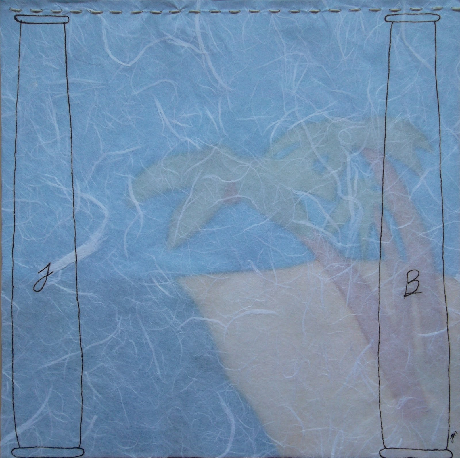
Joachim and Boaz
watercolor and pen and ink
9x9in
2010
Series: Choices
watercolor and pen and ink
9x9in
2010
Series: Choices
This piece is called Joachim and Boaz, the names of two columns/pillars that I believe were in/at Solomon's temple. I believe that pillars/columns as the above, can be symbolic for a transition, moving from one thing/place/etc. to another.
Update, so after I wrote this post, I went to Wulf's exhibit at the Springville Muesum of Art I noticed this painting of a similar title.


Subscribe to:
Posts (Atom)